I first mentioned With Jack’s conversion rate when writing about my goals for 2017. As of December 2016, 26% of people who got a quote with Jack became customers.
Over the past 12 months we’ve been tweaking key parts of the customer journey. The conversion rate is now at 40%—a 14% improvement from 2016.
Scrappy Beginnings
It’s everyone’s goal to launch with a polished, feature-rich product. I did the opposite. I talk about this in my last post, Minimum Viable Process.
A lot of tasks at With Jack are manually processed by me (generating quotes and binding policies). This is something I thought would be a hindrance, but has stood me in good stead with talking to customers and building a better experience. Every day I’m getting some form of customer feedback—good or bad.
I speak about launching with one polished feature in my talk, Idea to Execution and Beyond. For Jack that was the conversational interface. This was where I channeled my money and attention. There were other important parts of the customer journey that I launched without.
For example, With Jack launched without a risk questions form. I was sending people to Typeform to answer them.
Aside: The risk questions cause the biggest friction in With Jack’s customer journey. It’s a necessary part of buying insurance to see if your business is insurable or a liability. That you implement good practices like obtaining licenses for images you use, haven’t had any claims etc. That kind of thing.
Bootstrapping means moving slowly. This can be frustrating when it feels like everyone around me is raising investment and moving quicker. But I’ve really started to see bootstrapping as a blessing.
It means not building features for the sake of it because I don’t have the money to do so. It means taking one step at a time and using feedback to ensure what we’re building or the changes we make serve a purpose.
After launching with one, polished feature (the conversational interface), we turned our attention to the risk questions. It was a quick win. We stepped away from Typeform and built a self-hosted form. Nothing fancy. It looked like this:
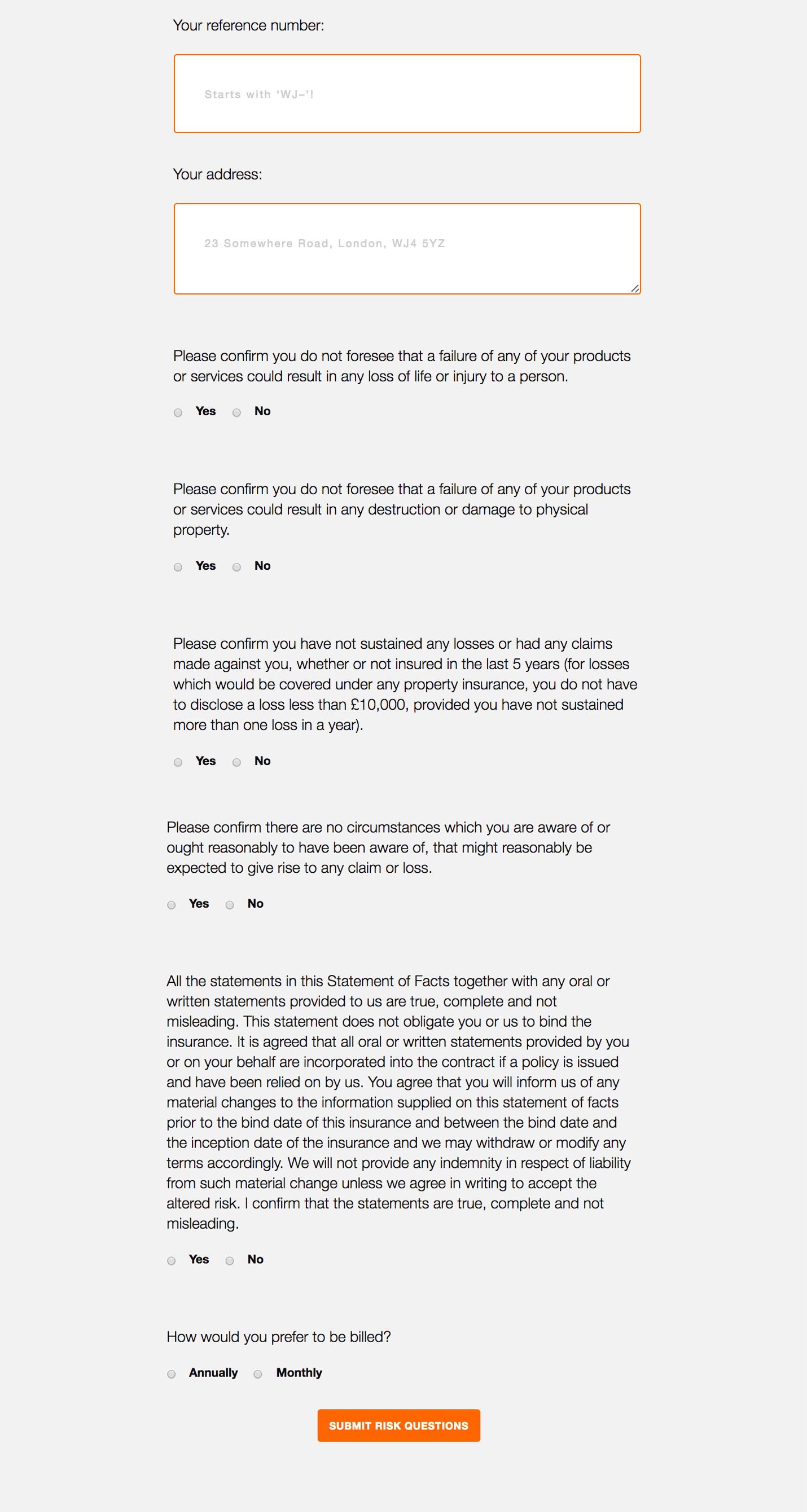
The risk questions suck, but not answering them invalidates your policy. They’re the worst part of the process and embody everything I hate about insurance.
Legal jargon that nobody understands. Text that doesn’t read in plain English. Questions that aren’t tailored to your chosen industry. I can’t imagine any scenario where a web designer’s work could result in loss of life, yet that’s one of the questions.
Frustratingly, I’m not allowed to change the risk questions (at least not now. In the future I may have enough clout to work with an insurer to write them). This part of the process is where users drop off.
The customer journey starts on a friendly tone (the conversational interface), but ends on something different (the risk questions). Transitioning from a chatty tone to stuffy and corporate is never going to be smooth.
That wasn’t the only problem. Some of the users who did hunker down and answer the risk questions found the process confusing.
“Is it the final step?”
“How do I pay?”
The Three Key Problems And How We Addressed Them
- People felt thrown by the change of tone and copy.
- There was nothing to indicate this was the final stage of getting insured.
- Payments weren’t clearly explained. Customers would receive an invoice after they submitted their risk questions. This wasn’t obvious.
Somebody once bought insurance ‘accidentally’. When I sent them their policy and invoice, they said “I didn’t mean to buy insurance. I thought this was just another step in getting my quote”. Clearly there was a problem.
I was enjoying a weekend away with Naomi Atkinson when talking about this. (Yes, I have bad chat. This is why my friends don’t want to hang out with me.) Naomi is a designer, so she suggested redesigning the risk questions to address these common confusions.
People felt thrown by the change of tone and copy
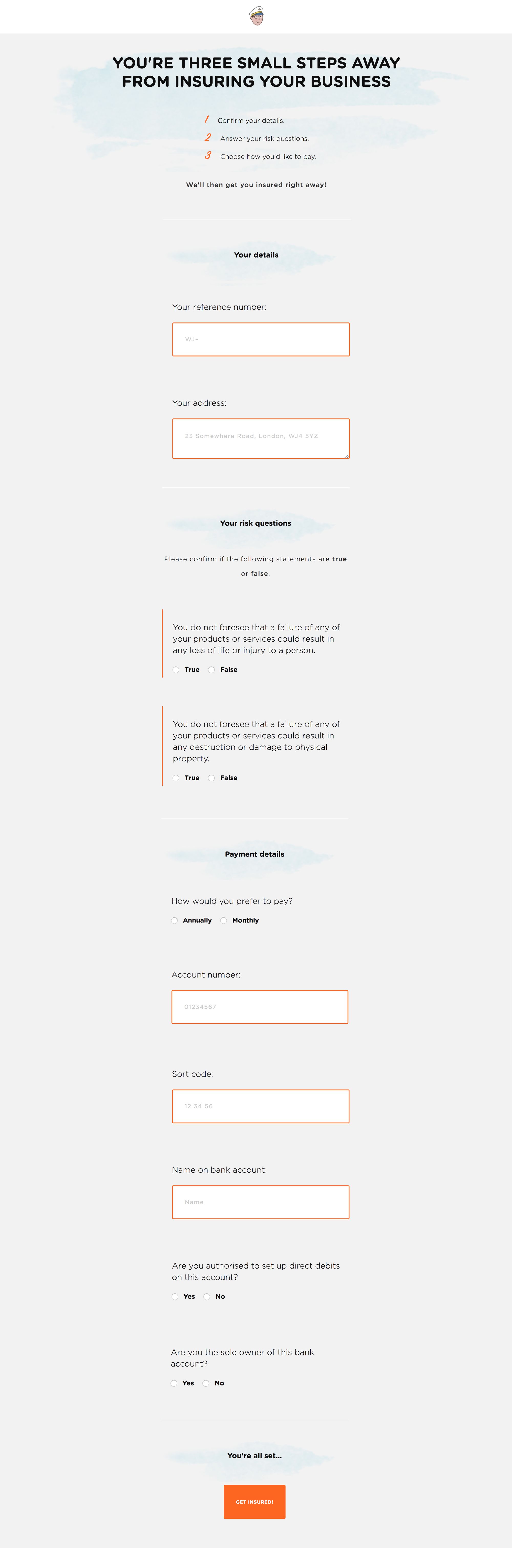
As I mentioned, there isn’t much we can do about this at the moment. We did make one tiny change that helped. We switched the ‘yes’ or ‘no’ answers to ‘true’ or ‘false’. This framed the questions in a way that read slightly better.
This has worked well. We no longer have people misunderstanding the questions and selecting the wrong answer. Emails from users asking for clarification about the questions have reduced.
There was nothing to indicate this was the final stage of getting insured
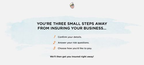
Naomi pre-faced the form by outlining the steps.
- Confirm your details.
- Answer the risk questions.
- Choose how you’d like to pay.
We also changed the call-to-action from ‘Submit risk questions’ to ‘Get insured’.
Changing the call-to-action is the simplest fix, yet gives the form focus. Asking people to submit their risk questions poses more questions (“Why? What happens next? What am I committing to right now?”), but providing a button to get insured gives clear direction.
Payment options weren't clearly explained
We changed how payments are handled. Gone is the option to pay by bank transfer and we’ve limited it to Direct Debit. Users can now choose monthly or annual payments (I’d estimate 95% of customers choose to pay monthly).
Taking Direct Debit details makes it feel more like a check-out process. It’s eliminated any confusion around payment.
This is what it looks like now:
These tweaks significantly reduced the drop-off rate.
- Changing the call-to-action
- Setting expectations by outlining the steps
- Offering better payment options
It all helped increase the conversion of quote to purchase by 14%. Oh, and since implementing these changes nobody has ‘accidentally’ bought insurance.
There's Always Work To Be Done
The sticking point is still the copy. The nature of the questions and the legal wording means some people abandon the process without getting insured. This pains me because the benefits of being insured outweigh the temporary inconvenience when buying it.
It’s a case of getting a cup of coffee, putting on your headphones and spending a few minutes pushing through the pain. A small trade-off for the sake of protecting your business from shit like this and this.
With that said, Scott (the designer I’m working with) and I brainstormed how we’re going to address this with the next version. We think we’ve come up with a solution.
Another issue we’re tackling with the redesign is the feeling of abandonment once you buy your insurance. At the moment, the customer journey is optimised around quoting and buying. Once you become a customer it can feel like you’re being deserted. That is until things get hairy or your annual renewal is due. We’re tackling this next. More on that soon…
This is what I love best about building With Jack. Listening to feedback and implementing it, then watching the effect it has. Finding problems or inefficiencies and trying to solve them. Getting more freelancers insured.